Archival API Plots: Difference between revisions
From EVLA Guides
Jump to navigationJump to search
No edit summary |
No edit summary |
||
| (One intermediate revision by the same user not shown) | |||
| Line 1: | Line 1: | ||
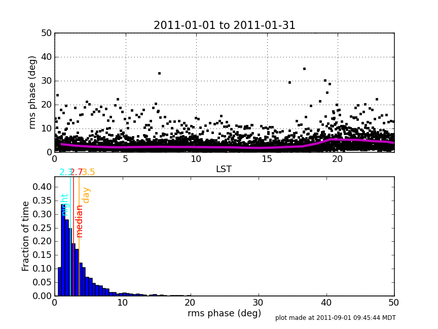
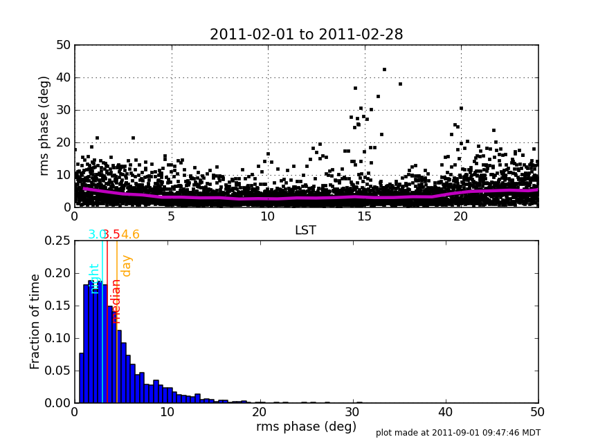
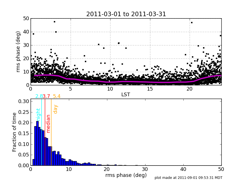
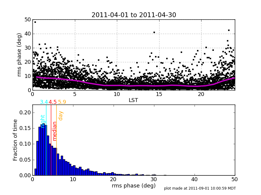
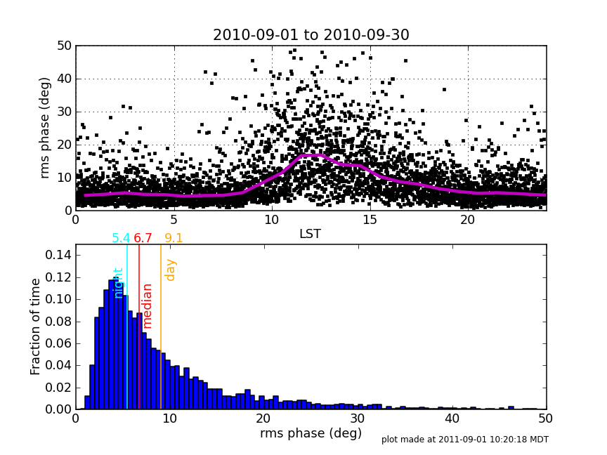
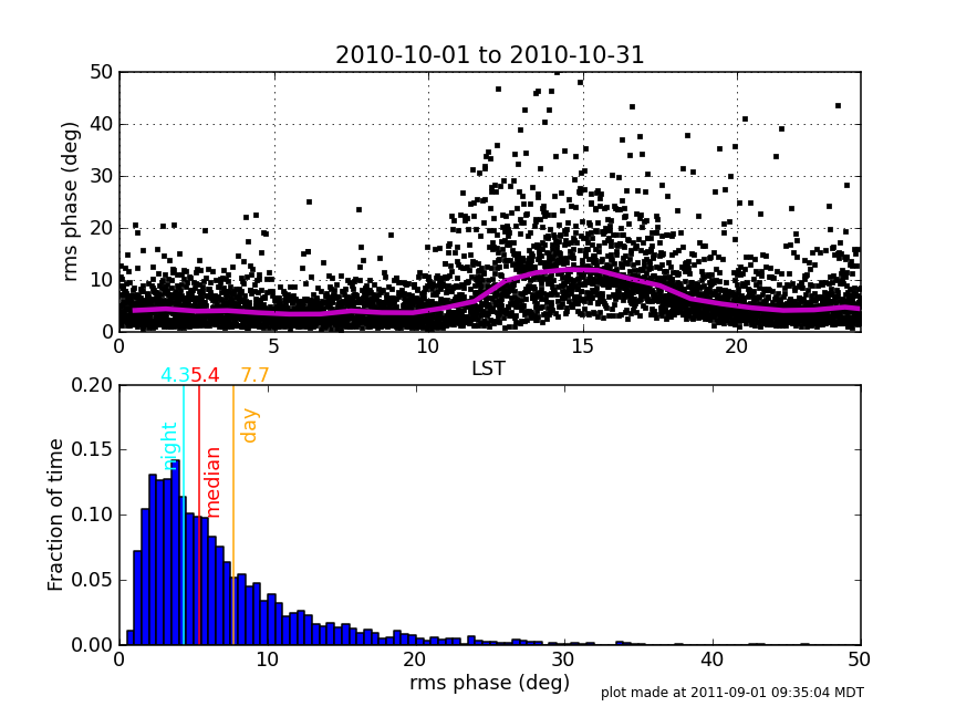
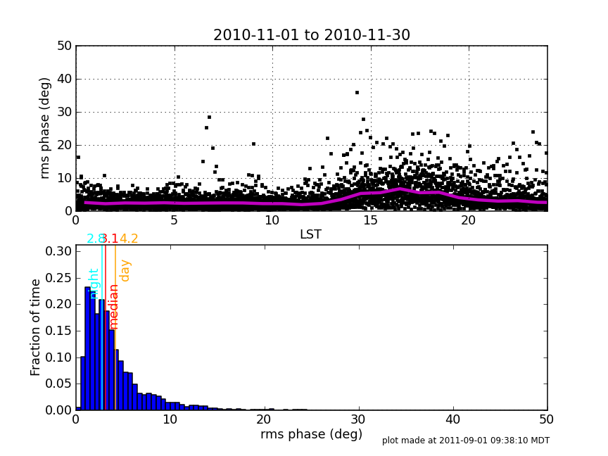
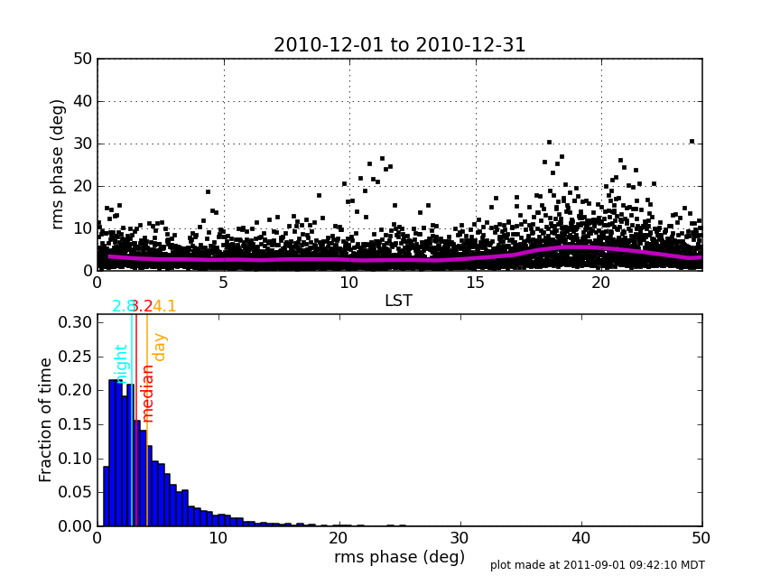
These plots show the API rms phase vs LST for each month of the year. The magenta line in the top plot is the median computed per LST hour. Click any plot to enlarge it. | These plots show the API rms phase vs LST for each month of the year from September 2010 through August 2011. The magenta line in the top plot is the median computed per LST hour. Click any plot to enlarge it. | ||
See also the [[Monthly_Conditions_at_EVLA|monthly plots of the fraction of time available for each frequency band vs. LST]] | |||
Return to the [[High_Frequency_Observing|High Frequency observing details page]]. | Return to the [[High_Frequency_Observing|High Frequency observing details page]]. | ||
Latest revision as of 00:06, 2 September 2011
These plots show the API rms phase vs LST for each month of the year from September 2010 through August 2011. The magenta line in the top plot is the median computed per LST hour. Click any plot to enlarge it.
See also the monthly plots of the fraction of time available for each frequency band vs. LST
Return to the High Frequency observing details page.
| January | February | March |
|---|---|---|
 |
 |
 |
| April | May | June |
 |
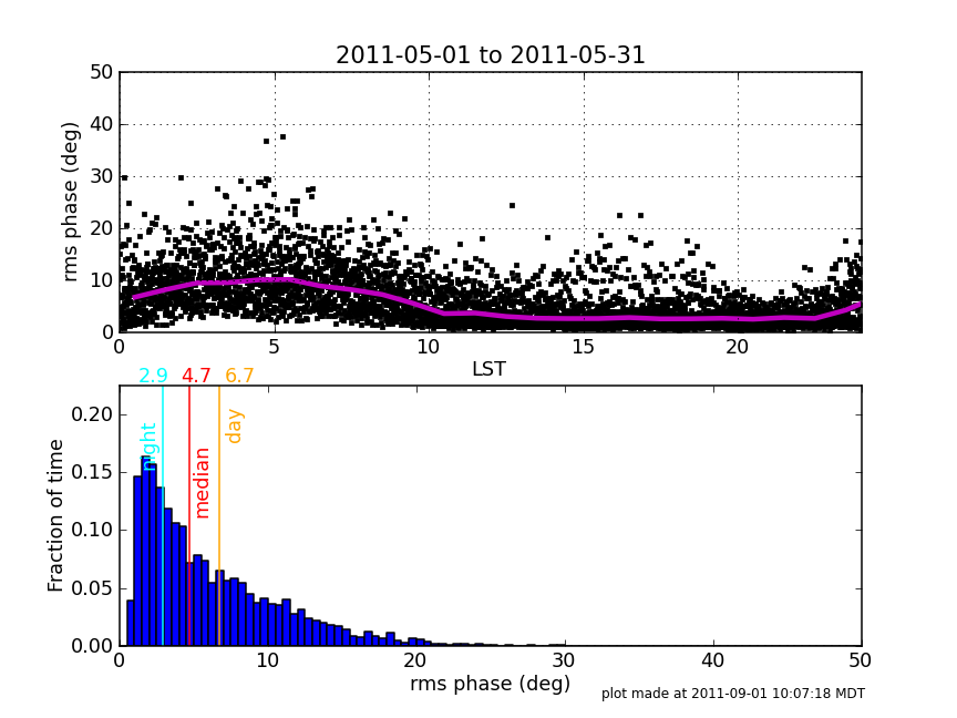 |
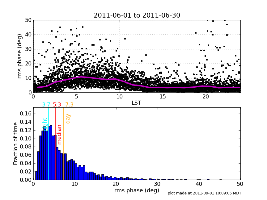 |
| July | August | September |
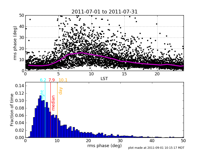 |
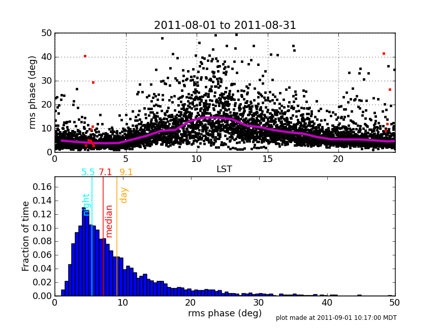 |
 |
| October | November | December |
 |
 |
 |